Top 6 Confusing Fonts That Should Be Avoided at Any Cost

Over the past few years, we have seen how branding has totally changed the fortune of businesses. One of the most crucial branding elements is the logo design, as it possesses the power to build trust and capture the audience’s attention. A logo is not just about artwork; you need to focus on all design elements for crafting a perfect emblem that resonates with your brand. In a logo design, typography carries inevitable importance as it portrays the name and slogan of the business and reflects its nature as well.
When it comes to typography, you might wonder which font is perfect for you to create a logo. Well, you can find several resources over the web that explain the best available fonts, but you must know about the ones that must be avoided at any cost. We are here with this blog to help you identify 6 confusing fonts that shouldn’t be used in your logo design. If you want to design an aesthetic and professional-looking logo design, you must make sure to avoid the fonts we are going to discuss below. So without any further delay, let’s get started!
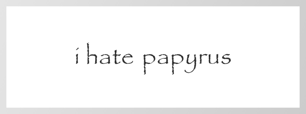
1. Papyrus
Papyrus is one of those fonts that comes within our computer. It was considered the coolest font to be used by all designers at least once, but that’s not the case anymore. Due to its texture, Papyrus was a decorative and stylish font that helped it in finding ways to be adjusted in all kinds of designs. However, things have changed now, and this font doesn’t have any value in your logo designs. Papyrus is a childish font that must not be used in your logo design if you want to be taken seriously and make an impact on the audience with your branding.
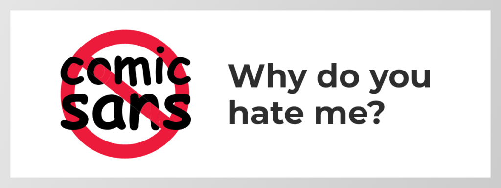
2. Comic Sans
The main reason behind Comic Sans existing in the list of top confusing fonts is its inappropriate usage. The best usage of this font was in children’s products, comic books, and party posters. However, its unsuitable usage in several professional announcements has become the reason behind its unpopularity. The over usage of this font has made it disrespectful among the viewers.
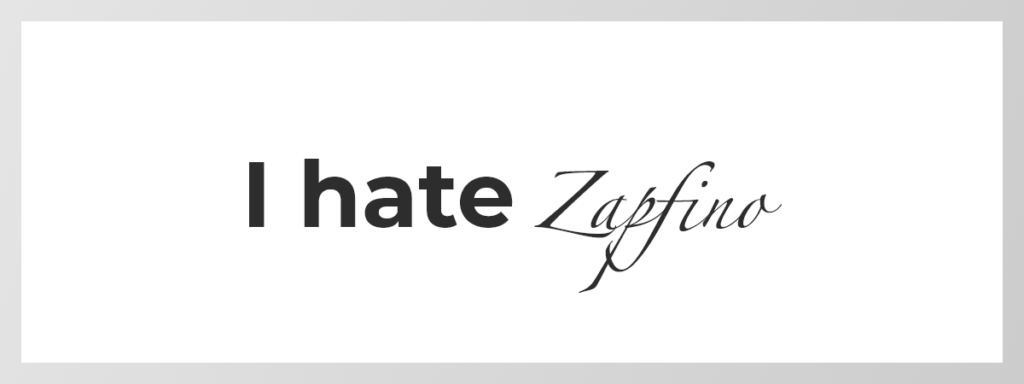
3. Zapfino
When it comes to sophistication and delicacy, Zapfino’s name comes right at the top. For a Windows user, it would be an attractive typeface; however, it’s a common font found in Mac computers. The over usage of this calligraphic font has earned it a position in this list of top confusing fonts that should be avoided at any cost.
4. Times New Roman
Times New Roman is a hard to read font, but it is still overused in many walks of life. The main reason behind the wide usage of Times New Roman is when Microsoft made it the default font for a prolonged time. However, this font should be neglected in the logo design due to its disinclined nature. You can find various fonts other than Times New Roman that can generate remarkable results for your business.

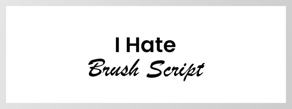
5. Brush Script
When it comes to opting for a script-type font, most of the designers choose the Brush Script typeface. The elegance and classy appearance of this font make it too consumed among the designing spectrum; hence, you should try to find other script fonts available over the web. This will allow you to add grace to your designs without going for the traditional typeface, i.e., Brush Script.
6. Mistral
When it comes to selecting fonts while crafting a design, you shouldn’t restrict yourself to the typefaces that are available on your computer. The beginner designers often choose the Mistral font, but it shouldn’t be continued because it gives quite a general and basic appearance. There are many playful fonts available that can work better than Mistral for sure.

That’s it!
These are the top 6 confusing fonts that should be avoided at any cost. Due to their over usage and ambiguous appearance, you must opt for the better ones that are easily accessible through the web. While logo making or any other digital design, you shouldn’t compromise on the typography element by using the confusing fonts discussed above. It’s essential to deeply investigate the fonts that will work best for your brand. Our team has researched and listed some top recommended fonts for you. Must read our next article to find out those Best Recommended Fonts for Logos.


